Color
A painting with a palette close to reality from Albert Bierstadt.

Another Bierstadt painting with more saturation.

The paintings above are approaching fantastical but similar palettes can be found in other movements. I want to focus on the more extreme color/lighting scenarios because it’s very specific to Romanticism. The main trait of the moment’s approach to color is that it be more dramatic than reality to glorify natural vistas: to light for emotion you feel and not what you see. Meaning: more vibrant, with more contrast in temperature and more contrast in saturation.
Aivazovsky using a vibrant palette:

Moana matching the emotion of a scene with its vibrant colors:


Aivazovsky’s use of temperature contrast: the warm boat (center of interest) contrasted against the cool seascape:

The Lord of the Rings uses this concept by also placing extreme color contrast at the center of interest:

Saturation contrast displayed by Thomas Cole:

A Lord of the Rings example of saturation contrast:

Lastly, Moana perfectly demonstrates all three concepts: a vibrant palette far from reality and has both extreme warm vs. cool contrast and saturated vs. desaturated contrast:

Sky Exposure
I found it helpful to learn more concepts of Romantic paintings by finding a landscape in The Hobbit that doesn’t feel interesting as the others. I narrowed down what’s lacking in this shot to lack of depth (no background), even lighting, and a blown out sky.

Another shot from The Hobbit better captures the eye with range and depth. It feels so much more like a painting because of it’s wider range in exposure in the sky. Paintings are a product of the human eye, and the eye has a wider dynamic range than a camera which why film having skies with more detail gets film closer to having the feel of a painting and not being “shot”.

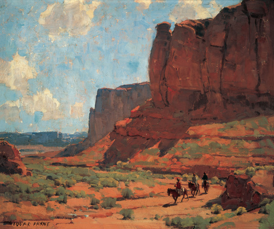
This is a side step from Romanticism, but deep detail in the sky is what makes shots from The Good Dinosaur so much more appealing and like an Edgar Payne painting (below).