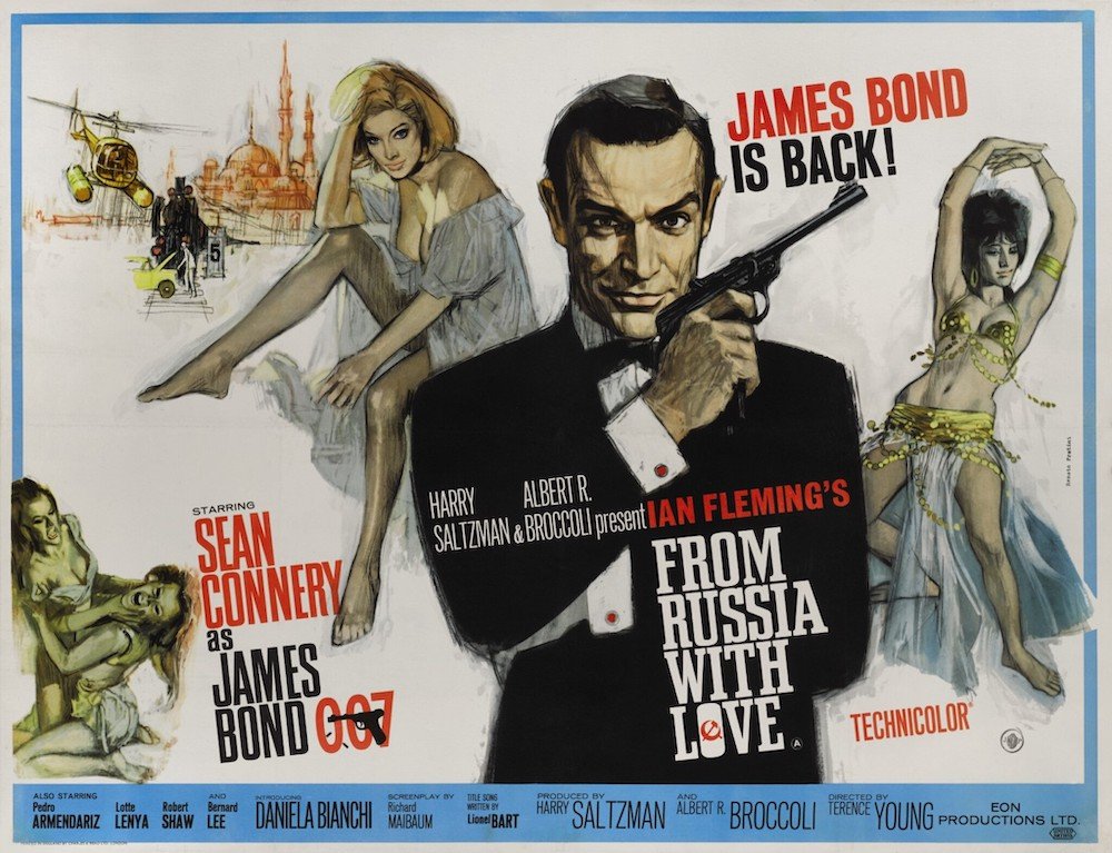
BLOCKING: HORIZON LINE
In this study, I wanted to learn more about the use of perspective in montages - specifically in the uses of horizon lines. In the posters below, we don’t see a great sense of depth - the prominent characters’s feet are more or less exactly on the horizon line, flattening the image. This does have the benefit of emphasizing the grandeur of the prominent character, but at the cost of depth.
Below, we see an example from Russia With Love using the horizon line vignette in the top left:
This mini scene uses depth to give variation to the otherwise flattened montage:
Below are Struzan examples of the horizon line break for depth:
IMPLIED HORIZON
I never noticed this before, but Struzan shows that you can imply an impossible horizon line that still gives the same effect of depth. I use “impossible” because the characters behind the prominent standing character are sometimes larger while still in the background, but still fade/vingette off or end at the horizon line.
NO LIMITS
In the Steven Chorney poster below, we can see 4 examples of perspective vignettes to give the poster a greater sense of depth:


