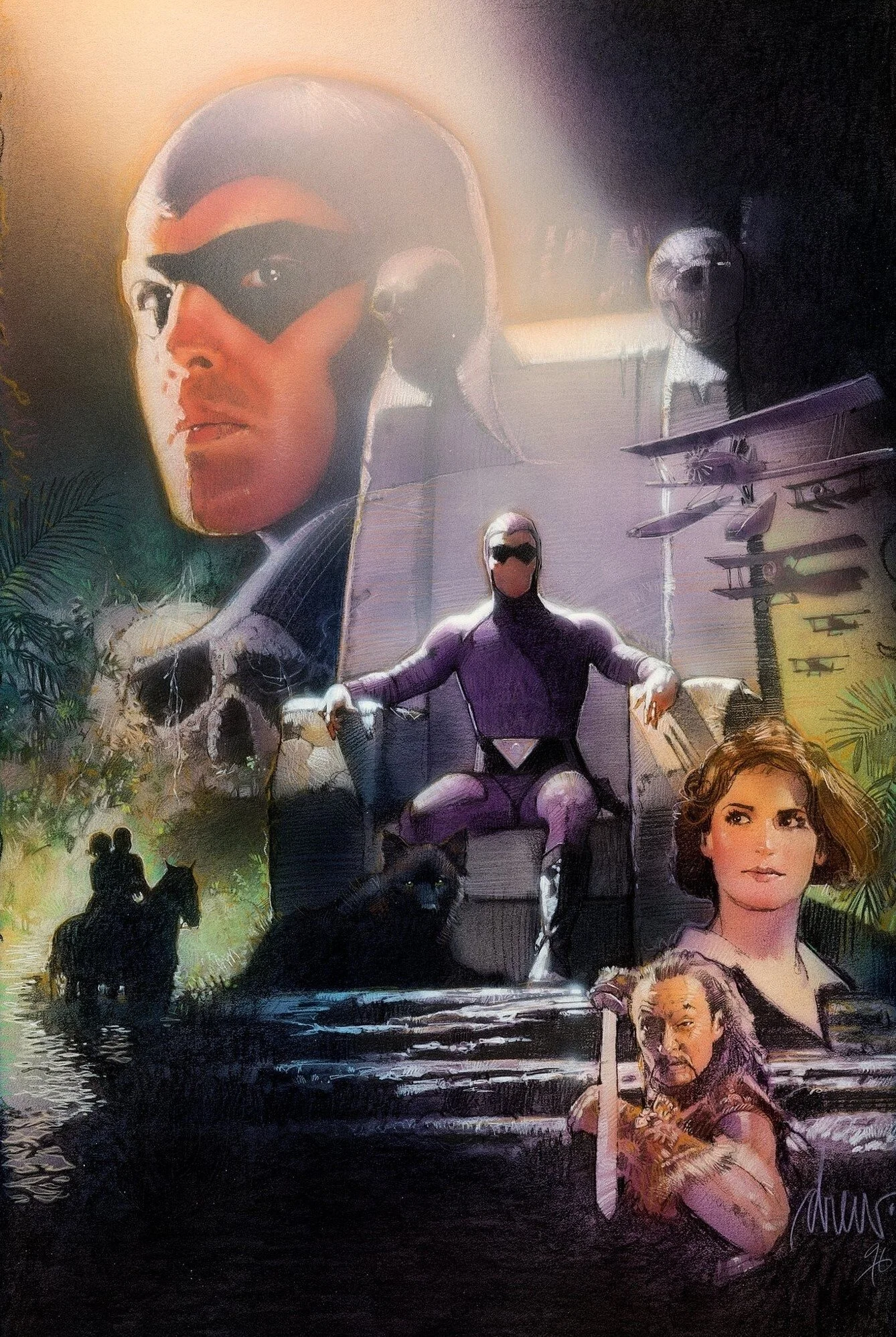
BLOCKING: STRUZAN PERSPECTIVE
I’ve been looking at Struzan posters more to find some of his composition formulas, and one I noticed was perspective in The Phantom poster below. The use of perspective gives the composition a sense of unity like they are residing in the same physical space even though it’s a montage: we are looking up at the Phantom seeing the underside of his nose, looking up at the planes, the Phantom and the female lead in the middle are at eye-level perspective, and the villain at the bottom has his head titled down seemingly lower in perspective.
The formula for this type of montage roughly follows the perspective rules below in the example image. Faces at the top show the underside of the nose, and of faces at the bottom on the poster don’t show the underside of the nose:
An extreme way to think about this concept is as the poster being a group photo taken by a fisheye lens which exaggerates perspective and face angles:
EXAMPLE 1
Another Drew Struzan example is for Cut Throat. Not only do the faces have the perspective rule applied, the skull flag at the top also does: it’s warped to the extreme to look like we’re looking up at the flag and seeing more of the “underside of the nose” of the skull.
EXAMPLE 2
Another example is Struzan’s Dracula:
EXAMPLE 3
The final example is Struzan’s Empire Strikes Back. He uses perspective to the extreme with perspective lines of shooting stars and with the ships and characters.
The concept is most certainly not used in all of Struzan’s work and especially not always in his most famous posters, but it is one I’ll look out for more and will try to use. There are so many techniques Struzan uses and I can’t wait to learn more!.


