
Blocking: Struzan Top/Bottom Balance
When I think of montages, I usually think of the poster below: Montage elements are large at the top and get progressively smaller as they move down the poster:

I did notice Struzan break this convention in several ways, but was not able to find a pattern and put a name to it. That changed when I noticed the same technique in the 3 posters below that I’m calling “Struzan’s Top/Bottom Balance”. It’s when the Poster’s top is a large form (in this case Vader) and the bottom of the poster has a head of equal size (in this case Palpatine):


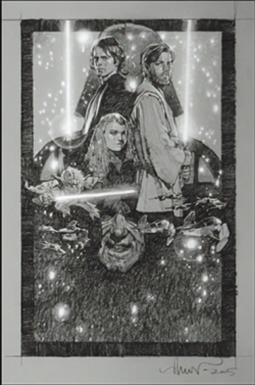
This was a paradigm changer for me since I was used to images getting smaller as they moved down, but can see how this frees up the montage for more opportunities by mixing large/medium and small elements all the way down to the bottom and keeping hierarchy based on size of the character.