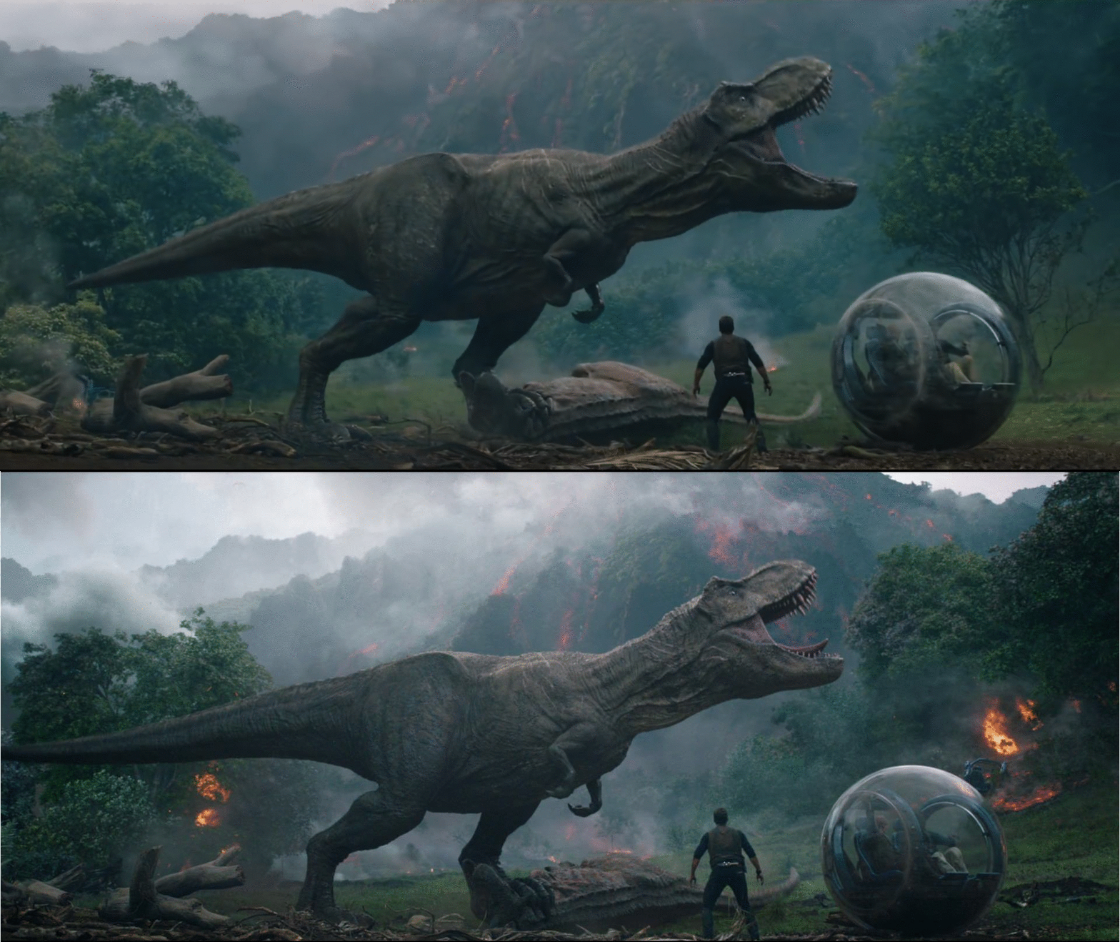
EYE TRAINING: COMPARISON PART 1
One of the most invaluable training exercises I’ve learned since coming to ILM is learning through iteration comparison. It’s an exercise I do at both at work and at home (Fox Studios Logo Sequence Study).
This type of study exercise involves comparing two images at different stages of completion to be able to articulate what exactly has changed in the image. It’s more than seeing what has changed, but why the changes adds clarity or visual interest. For example, this study will use the line:
BLANK was changed to achieve BLANK CONCEPT
The goal of this exercise is to both help improve critique skills and to train your eye on knowing how to push a good shot to be even better.
EXAMPLE 1
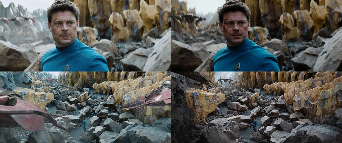
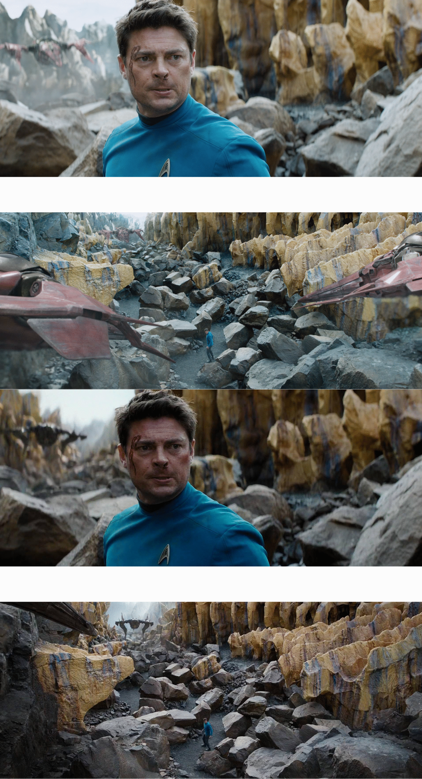
Star Trek: Beyond. The images on the left are from the teaser, and the images on the right are in the final movie.
I provided my breakdown of what has changed after the gif below, but for the exercise, try to breakdown on your own what has changed and how it helps the final image.
added more plane layers in the background to add depth
added fog between each new layer in the background for value contrast and more depth separation
added more haze in the background to make it feel more extended to add depth
changed the ship materials to be darker so they can stand out better with value contrast
removed haze off of ship in bg so the they eye can be drawn to it with value contrast
adjusted walls of canyon to add more repetition
added higher level of boulders in the background canyon path to connect mid-ground to bg in the close-up and variation to the floor height
EXAMPLE 2
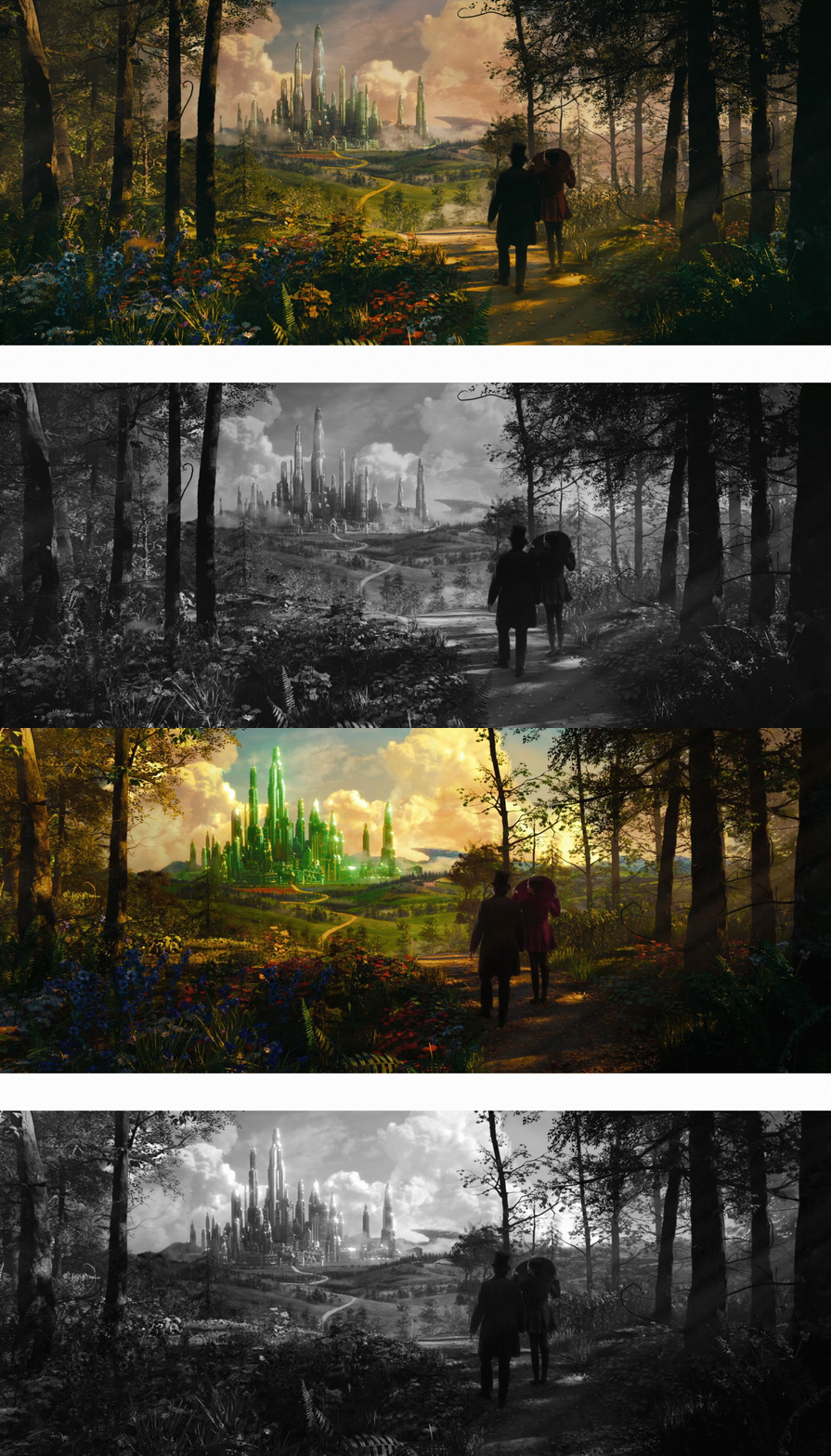
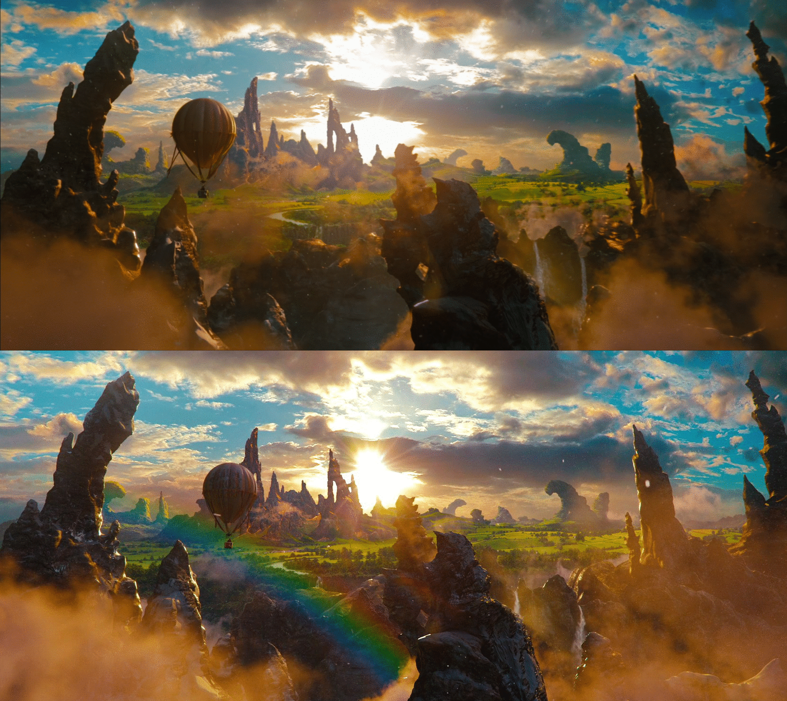
Next is Oz: The Great and Powerful. The image on the left is from the teaser and the image on the right is from the final film.
I added a black and white image for value comparison to help catch more changes.
reduced tree foliage to see more of the sky.
removed center screen left tree so the Emerald Castle doesn’t feel confined in the composition.
removed the heavy fog in the middle of the screen right valley. It was creating strong value contrast behind the trees, pulling the eye away from the castle.
reduced overall fog in both castle and mid-ground to add clarity
added shadow to the foreground screen left flowers to keep attention on the castle in the background
added stronger sun glints on the Emerald Castle to both draw the eye with value contrast and describe the material
added more contrast to the shot (including brighter clouds) to help the castle pop more with value contrast
darkened trees with brown in mid-ground to give them more value contrast over the grass to add variety
bluer mountains to add more depth
changed proportions on castle to slightly shrink the scale of the castle
There are so many examples to breakdown and learn from. Happy studying!
