
Lighting: Spherical Fundamentals Part 2
Part 2 of this study will go over more concepts that make objects feel rounded and appear 3D. This study will mainly use examples for the poster artist Drew Struzan:


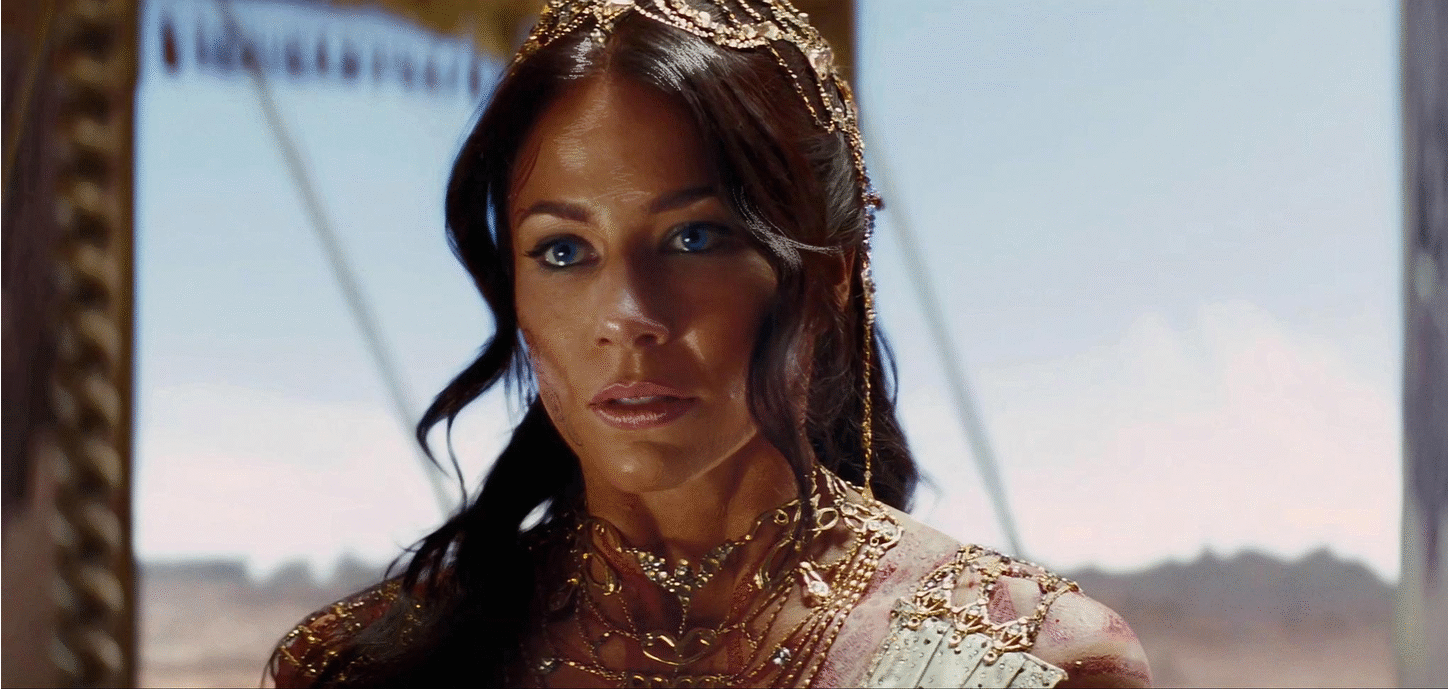
TIGHTENING HAIR SPECULaR HIGHLIGHTS
While Struzan traces many of the elements and characters in his posters, he makes great effort to make them feel more 3D with lighting. Note this example of how he gives more shape to the hair:
The hair on the screen left and the hair by his screen right eye have a higher specular value to make the hair silkier. This emphasizes the curls in the hair.
(a before and after with what I assume was the starting image:)

This change adds a little more visual interest because it has tighter specular values and more contrast, and emphasizes the lighting source/direction. An emphasis on lighting helps the shape feel less flat. Stock example:

Struzan uses this technique again in the poster for Zathura. He loses most of the mistone highlights in the boy’s hair and pushes for a higher specular texture on the hair.

STRONGER skin SPECUlAR HIGHLIGHTS
Returning to the spherical lightning diagram from Part 1 of this study, the highlight plays a major role in showing the roundness of an object because it sells lighting direction:

Struzan added stronger contrast highlights to the nose, lips, eye lids, cheeks for more rounded features that plays up the lighting:

PAINTOVER PRACTICE
A study I did to put these concepts into practice:
enhancing or painting in hair specular highlights
adding skin highlights/shadows to round out the chin and nose
adding more specular highlights to the lips
small shadowing/highlights on face to add more defined shape
Another study I did:
more spec on nose, forehead, hair, lips
darkened lip shadows
added eye spec highlights
warmer tone
