
Struzan CONTRAST part 1
I wanted to look more into how Struzan uses contrast. This is somewhat related to the rebalancing series, but is actually more about how to block out elements based on contrast in the composition. But first, let’s review contrast. Contrast is what makes an element easy to see over a background. Below, we see it in its two most basic forms from Struzan: On the left, Dark over Light. And on the right, Light over Dark.


SUCCESSIVE CONTRAST LAYERING
The concept of contrast layering can also be done in repeating steps. Struzan’s The Lost World: Jurassic Park composition below features strong “Successive Contrast Layering” with the dinosaurs layers as “light over dark over light over dark”. And the plant elements also stand out with strong contrast :

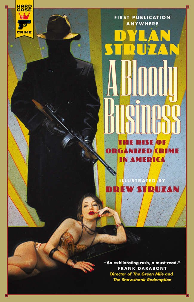
Struzan’s Prince Lightstar comp uses this as well. It features a small dark character on a light building on a dark character on a light character on a dark background:

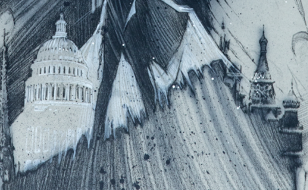
Also in the Prince Lightstar comp, the bottom buildings (Capital and the Kremlin), seemingly continuous shape, switch values to remain in high contrast - this is called Counterchange.
COUNTERCHANGE
I first learned about counterchange on a James Gurney blog HERE. Try squinting at the two Struzan pieces below to see how he uses coutnerchange (they’re both dark over light at the top, and are light over dark at the bottom)

The Struzan examples below show counterchange specifically in the Lucas/Speilberg section.:
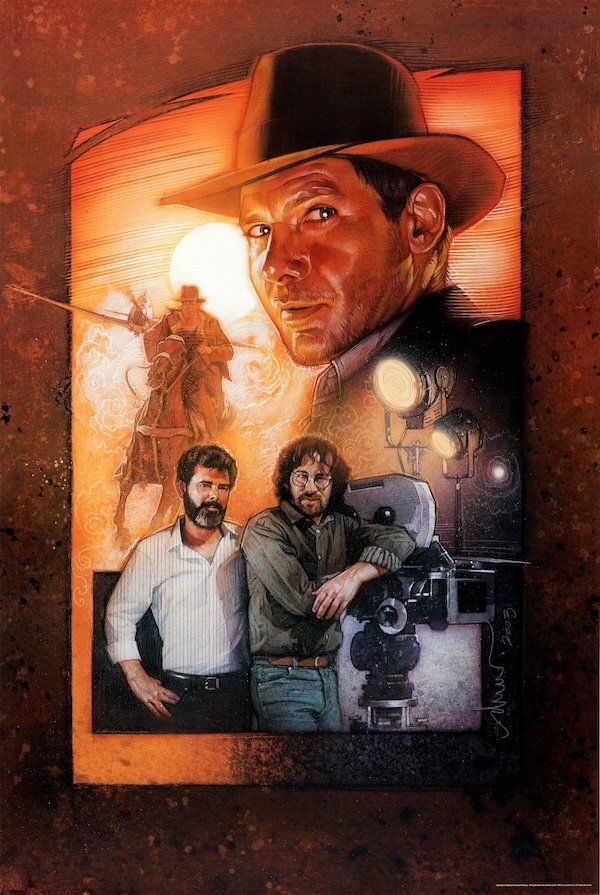
George’s light shirt is over a dark background, which is over a light part of the extreme background under the box. And Steven’s dark shirt is over a light background which is on top of the dark part Indy underneath:

PATTERNS counterchange
Next, I want to focus specifically on how Struzan uses counterchange on pattern elements. I can also be seen as “from negative space to positive space” and vice versa
In the comp below for Heat and Dust, Struzan uses counterchange on the screen-right pattern element:

Struzan uses the same technique below: In the top left corner of the frame around the leopard, the swirly lines are “light over dark”, and on the yellow, they are “dark over light”


Same for the diagonal line elements below in the Glenn Miller comp: Top is “dark over light”, and the Botton is “light over dark”
