
STRUZAN CORNERS: PART 1
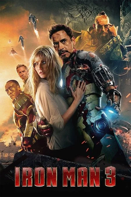
For this study, I wanted to keep up the approach for finding new concepts by looking at everyday posters that I feel are “Struzan” or “Not Struzan”. I came across this poster below from Iron Man 3. And this got me interested to see why the character placement in the top right seemed a little “Not Struzan” to me.
This got me looking at posters that I thought felt more Struzan and also began a composition element flow in the top left:


TOP LEFT CORNER
Struzan is often biased to have the upper-most element begin in the top left. To balance this out, that usually means have the lowest-most element end in the bottom right.


Below for Blade Runner, we can see Struzan favoring starting the composition flow in the top right in the comp, but for the final, placing the hover car in the top left. It could be because Western cultures read from left to right, top to bottom, so it may not work best for eye flow to begin in the top right corner.


TOP RIGHT CORNER
For the top right corner, Struzan, usually prefers not to crowd it out. In the Force Awakens comp below, Kylo takes up the upper-most space in the right corner, but for the final, Kylo is moved to allow more negative space in the top right corner,


However, one lesson I came across in this study is how Struzan uses “direction” in the top right corner. In the 3 pieces below, Struzan has faces and objects in the top right corner face left. This gives the effect of re-directing the energy out of the top right corner.


