
STRUZAN POSITIVE NEGATIVE PART 2
The studies continue! I wanted to learn more about how Struzan uses negative space in his work to balance out all the positive elements.
BALANCE - POSITIVE/NEGATIVE
Let’s start with the Indy poster below:

Struzan balances out the two main elements (the large head and Indy) uses different space strategies. The large head acts almost as negative space with the overall frame. And Indy acts as positive space:

The bottom is balanced out with Counterchange (explained HERE). The bottom left is positive space of bones, and the bottom right is negative space of bones and leaves:

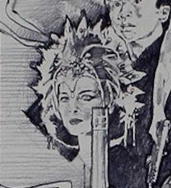
Let’s turn to the Last Crusade:

Struzan balances out Sean Connery and Harrison Ford by making Sean Connery cut out by negative space, and Harrison is positive space that has other elements layered on top.

Let’s look at a smaller example of balance of positive/negative balance from Struzan. In his Big Trouble in Little China comp, he creates it with in the character frame:

The far left woman’s neck cuts into the shape with negative space:
And to balance this out, Struzan uses positive space on the far right character:

And in the Struzan poster below, the bottom is cut out by negative space grass, and the top tree is layered as positive space to balance it out:

REST - POSITIVE/NEGATIVE
The two Harry Potter posters below from Struzan both use balance between positive/negative space. But What else I gained, was how the negative allows the eye to rest and gives the eye less to traverse over. It allows the eye to “skip” to what matters and not get too lost:

The balance and rest in the first Harry Potter poster from Struzan - positive quitich, cast and Hedwig balanced by negative space behind Hermonie. The black behind Hermonie provides balance and rest on the right opposite Dumbledoor’s busy layering on the left:
