VISUAL INTEREST: CHORNEY OUTLINES PART 1
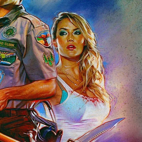
Along with Drew Struzan, Steven Chorney has a very distinct style of outlines for his characters in compositions. Along my path to break down and find the rules Struzan uses for his outlines, I thought it would be helpful to learn more of Chorney’s style.
Typically, Struzan, like in his drawing below, keeps the colored outline constrained to the perimeter of the character - here we see the green is only matching his silhouette:
EXAMPLE 1
Chorney, on the other hand, puts the outlines inside the character. In the piece below, we see how he uses the red outline both in the exterior of the character, the interior along the lines of clothing and where the face meets hair and head gear. The red outline also doubles as the color of the shadows, serving a double purpose both to shadow and bring dimension and stylize. The red is even introduced into the headpiece - slight red shadowing, and slight red outline along the edges:
EXAMPLE 2
In this next piece, we see more of the use of red doubling as shadow color and outline color:
Red is used to outline the woman on the outside, outline her top, is used for the character overleaping her to create more color harmony:
EXAMPLE 3
For the last example, we see similar use of a warm outline, but the shadows are cooler, so the warm outline is restricted to going around overlapping or light-shadow transitions in parts of the character:


