Visual Interest: Fox Logo Iterations
I’ve recently became fascinated with how updated studio logo sequences improve on the originals. For some studio logos, they look more pleasing with better art direction and more realism, but I was so curious as to why. And I wanted to learn more about what concepts the CG artists and compositor used to make them more cinematic, romantic.
We’ll look at the 20th Century Fox Logo
Lighting
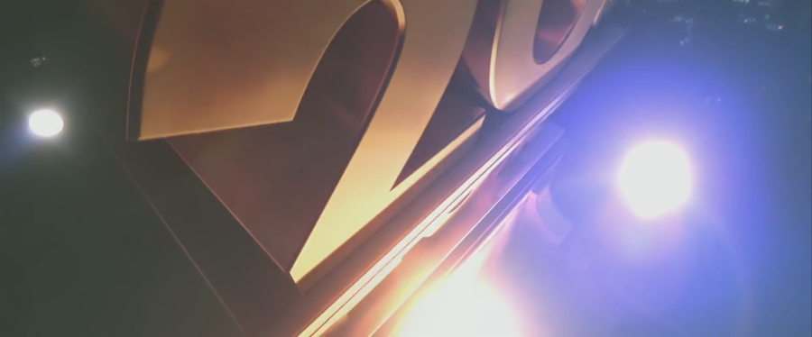
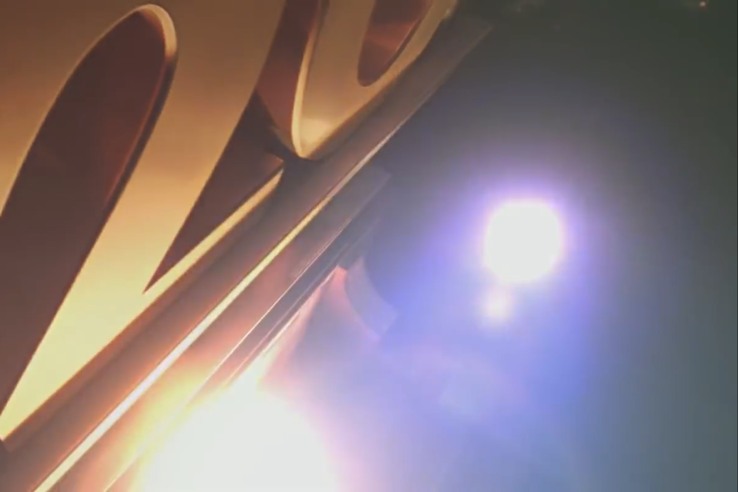
The most noticeable difference in lighting is the addition of lens flares from bright sources in the lens. It adds realism by having light values go over 1 in the camera and flash the lens to lift the black values.
The new sequence also adds variation to its lighting: Color temperature variation. The outer search lights are cool while the light illuminating the logo is much warmer. This also creates lens flare variation to keep the opening frames less uniform.
The original sequence did feature a lens flare for the Sun. But it feels like the light source itself isn’t strong enough for such an opaque flare.
The new sequence blows out the source of the light to justify a stronger, brighter flare.
The search lights are also more realistic in the new sequence. They have more of a quadratic falloff with softer edges.
The second improvement in lighting is actually in shadow. The under lighting on the logo is properly shown in the newer logo with the ledges casting shadows onto the text. The cast shadow onto the text also increases the sense of depth by shaping the text with a wider value range. And the shadowing also reinforces that the text is behind other objects in space.
Depth
Continuing with improvements in depth, there is more parallax in the newer logo sequence: The palm trees in the mid ground. When the camera moves, it adds another plane of depth, and it makes the logo feel less like an “A over B” composite in the final frame and more like a deeper composition.
The palm trees are also hazed based off of the sky behind it which bring us to the next concept of haze color.
Variation in Haze Color
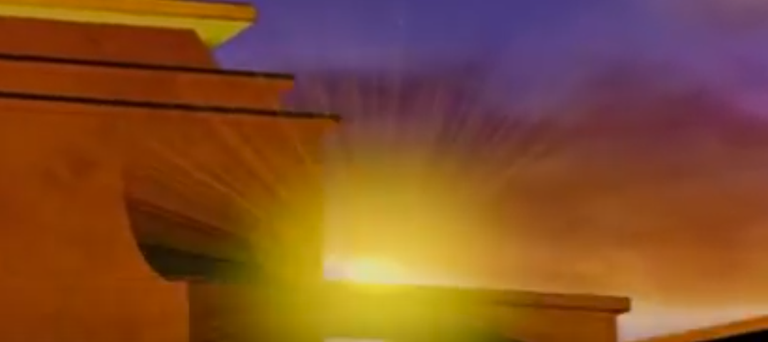
One of the most mind blowing things I’ve learned at work is how to color haze. In the older version of the logo sequence, The haze is uniformly red. But what I learned is that haze is really a reflection of the sky color. So if you flip the sky across the X-axis, you’ll have more accurate colors for your haze. The newer logo sequence is not an exact copy of the sky colors because the yellow is missing, but we do see it fade from a warm color to a blueish purple.
Texture
Another large improvement in the new sequence is texture.
By adding reflective quality to the metal logo, the structure reflects the environment and becomes tied to the rest of the scene. This makes for better integration.
The reflective texture also works well with the updated modeling of the logo that has beveled edges. It allows parts of the logo in darkness to still have a bright outline so that we can still read the form: like the “Y” and the “X”.
What also stood out to me was the addition of varied panels at the the base structure of the logo. Not only do they vary in rectangular shapes, but they are vary in value within the same part of the color wheel.
Adding panels also helps give the structure better scale by showing a real building material we can relate to the real world.
Scale
Another addition that gives better scale in the new logo sequence is the stairs. The original stairs miniaturized the structure by the steps being so large.
The newer stairs were made much smaller so that the building would feel more grand.
There is also better scale with light falloff on the search lights. Having more of a falloff in Y makes the logo feel larger. This is also aided by having a lower camera angle in the last frame to increase the scale.
That concludes my study on the Fox logo! I loved sitting down staring at the differences trying to articulate just what made the overall image look more visually interesting. Happy studying!
