VISUAL INTEREST: STRUZAN OUTLINE PART 2
For this continuing study, I wanted to dig deeper and create a pseudo guide for what value would Struzan use for an outline and when. Of course, he creates and breaks his own rules depending on context, so the purpose of this study was to get the best approximation of his instincts.
BRIGHT EDGE OVER BRIGHT BACKGROUND
For bright edges of objects, this most refers to any rim-light part of a character. This type of outline gets the most emphasis because it puts a white outline against a black outline for maximum contrast. Outside of the black outline is a hard or soft midtone to soften the transition to a bright background:


MIDTONE EDGE OVER BRIGHT BACKGROUND
Onto midtones over brights. This follows the same rule - a black outline and a midtone furthest-most outline to ease into the brights.


DARK EDGE OVER BRIGHT BACKGROUND
This is a little more rare for Struzan, but when he puts dark over bright, the same rules apply - putting a midtone between the dark and bright for a smooth transition:


BRIGHT EDGE OVER DARK BACKGROUND
When Struzan puts bright over dark, it’s usually as a lens flare or light effect. The two images below show two of his approaches: On the left, white with a white glow blurring directly into the dark. On the right, a bright object surrounded by a midtone to soften the transition:


The image below shows both concepts at work: The left, a white glow over dark, and on the right, a red midtone around the bright ship:

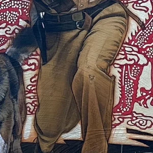
MIDTONE EDGE DARK BACKGROUND
For a midtone over dark, Struzan keeps it simple and retains the black outline around the object and places a midtone around it to ease into the darkness:

Below, we see the red and blue midtone outlines around Rey:


Frank Sinatra example on his misdone hands, with a pink midtone outline over a dark background:

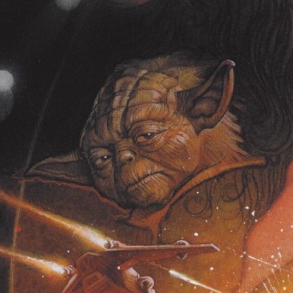
This shows a little flexibility. Below, Struzan applies this rule to the screen left of the image for Yoda’s bottom ear, but puts the midtown directly against the darkness on the top of the ear:
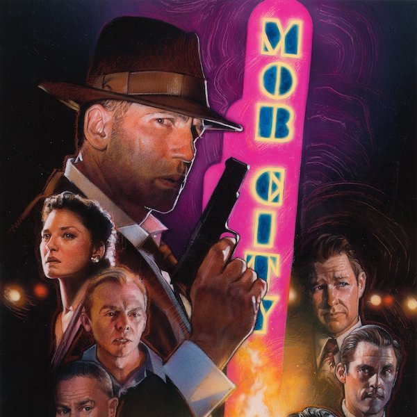
DARK EDGE OVER DARK BACKGROUND
For this combo, it’s actually a little rare for Struzan to outline for dark objects over dark (he usually lets the darks bleed into each other with shape welding). But parts of the object will still need to be defined with outlines. And when they do, they get midtone or bright outlines:


Below is an example of the man a the top right having his darks bleed into the background. and the figures at the bottom outlines by midtones:

Same concept applied with a bright outline to the lower part of the image:

BIRGHT EDGE OVER MIDTONE background
Brights over midtones follow the basic Struzan practices of a black outline and midtone outer outline. The midtone outline is usually a little brighter than the midtone value that it is going over.


Granted, the black outline is not always included. For hair that is frayed and flowing, black outlines would be distracting and break the rim-lit effect. So below only has a midtone outline around the hair in select places.

A breakdown of the concept below:

MIDTONE EDGE OVER MIDTONE background
No surprises here. A black outline with a midtone on the furthest-most outline. The outer midtone is either darker or brighter than the misdone in the background. An example with a darker midtone outline:


An example with a brighter midtone outline:


And sometimes Struzan puts the black outline directly against a dark midtone in the background:


DARK EDGE OVER MIDTONE BACKGROUND
Lastly, a dark edge over a midtone. Here, Struzan usually keeps the outline a brighter midtone over a darker midtone background.


