
TRANSPARENCY PART 1
For this study, I wanted to learn more about what makes Struzan’s use of transparency effective and what might have inspired him.
Below is Struzan’ poster for The Jungle Book. The top right corner shows a set piece over the top of Mowgli’s head with transparency:

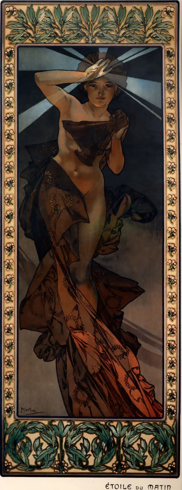
The earliest use of transparency I can find for design elements comes from Alphonse Mucha in 1902:

Struzan’s predecessor, Bob Peak, used transparency prominently on a poster for Apocalypse Now with the Sun and helicopter scene over Brando:

I wanted to see what made this use of transparency helpful for the design. So I removed the transparency (on the right). I did not notice a major change in the read of the design.


I did another test on Struzan’s The Phantom poster. On the right, we can see that the read of the throne is lost and too much attention is drawn o the lower right corner of the neck of the floating head. Transparency allows the two elements to live together with design harmony.


This got me more interested in seeing what designs must have transparency or they fall apart because transparency is the design glue. Hugh Fleming’s art for Alone in the Dark is on that list: If any element is fully opaque over the hockey mask, the poster would feel too cluttered and the hockey mask face would not be easy to read.

Lastly, Drew Struzan’s poster for Heat and Dust is another that falls apart without transparency - the sunset would be lost, and the umbrella would cover the main character’s face.
