VIGNETTE PART 1
I wanted to get a fundamental grasp on the basics of montage-making and learn about how to place multiple elements into a composition. I wanted to learn how Strzuan fades and blends multiple elements and how to categorize those methods. The Struzan posters below blend multiple elements with different transition methods.
Let’s get started!
Carve Vignette
The simplest method to start with is what I’m calling the “Carve Vignette”. This is when an element is cut from its original form. For example, below, the crew are either carved at their collar or carved at their waist.
In this Indiana Jones example, Struzan uses a collar Carve Vignette on Henry Jones, and carves out Sallah by his jacket.
FADE VIGNETTE
“Fade Vignette” is when one element fades into another. This first type of fade was previously covered HERE. Below, we see the character on screen-left fading into the face of the larger woman.
This second type of fade includes Shape Welding which was previously covered HERE. This is when, for example, black of one element fades into black of another.
BARRIER VIGNETTE
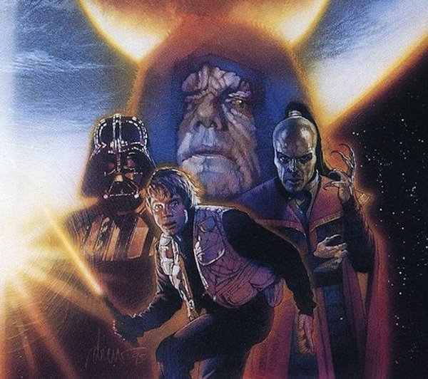
The next type of vignette I see use often by Struzan, is when an element is place behind other elements, that cut off its edges. I call this the Barrier Vignette.
Below, we see the Emperor behind the other elements. This character would have wide shoulders that we would see on screen-right of the composition. But those are cut off using the Barrier Vignette. We don’t see where the character ends behind the other elements.
Below, we see Struzan use the Barrier Vignette on Indiana Jones in his lower half. Each element below makes his lower half a sharp transition.
BARRIER-FADE VIGNETTE
For the last concept, we will look at what I call a “Barrier-Fade Vignette”. This is when a subject fades into another element, but the fade is interrupted by a barrier to ease the transition and make a shorter fade of an element less apparent.
Below, we see Han Solo, element using a Barrier-Fade Vignette. His lower half and sides fade off, but are interrupted by a barrier of x-wing elements.
In the Crimson Skies example below, Struzan has the two floating heads fade into the composition, but into a barrier of both a horizontal lens flare and airplane elements to hide the rest of the fade.
PUTTING IT ALL TOGETHER
Now, let’s bring it back to the beginning and see how the two Struzan posters below use the concepts from above.
EXAMPLE 1
The two major characters are both vignetted by a Barrier Vignette both by the screen-left skulls and treasure chest and the fire/ship elements below.
The screen-left characters on the side use a Carve Vignette
At the bottom of the poster, the ships on the sea uses a Fade Vignette.
EXAMPLE 2
Next is Struzan’s poster for the Phantom Menace.
Darth Maul’s element, uses a Carve Vignette, the bottom of his face is cut off by a Barrier Vignette, and the blacks of his face blend into the poster using the Fade Vignette.
Padmae uses a Carve Vignette on her lower half, and her screen-left side uses a Fade Vignette:
Jar Jar also uses a Carve Vignette with a slight Fade Vignette at the tips of his ears.
Qui Gon-Jinn uses a Barrier-Fade Vignette. The barriers are the Anakin, the ship and the droids.
Lastly, Anakin and Obi-Wan also use a fade vignette.


